When you type a query into Google search, you probably don’t think about the web crawling, indexing, and parsing that was needed to produce the results. And though you sometimes try different search strings to refine the results, nobody trained you to do that. On Amazon you can find, order and have delivered to your door virtually anything you want, with a few clicks of your mouse. And on Facebook, you easily post pictures and connect with friends around the world…from any device, anytime and from anywhere.
What is common to these applications is that the complexity of the application has been moved to the backend so the UI is simple and intuitive. Which is the number one rule of good UI design.
This winter, I had interned with IRIS as I was interested in UI-UX development and there was post available in IRIS. The prerequisites for the post included HTML, CSS, Bootstrap, Javascript, JQuery, Ruby On Rails (which was optional).
The Interview
After registering for the post, I was called for an interview, during which I had to list my frontend related work and projects that I had previously done. I had explained why I was interested to work with their team and for the respective project followed by certain questions about how confident I was about my skills. Working on the technites 2K18 website had given me a bit of an edge. On the same day, I got a message informing me that I was selected as an intern for UI-UX team in IRIS and I was given the UI-UX analysis of the placement Module. I worked on both UX analysis and UI designing parallelly.
UX Analysis:
The first half of my work included an analysis of the 75 feedbacks which were given by different users like SPoCs’, ICs’, PCs’, students and Faculties which were already collected. I had to classify my findings into 3 categories MUST, SHOULD and COULD, and document it. I used google docs for the same and discussed whether my findings were implementable or not with the team.
For the second half, I worked on the recruitment schedule page where I had to contact the users of it, collect their feedbacks and again classify them considering each and every user in mind, and then discuss with the team whether the feature which the user requested is possible to implement or not, if yes, then what are the possible ways to do it followed by documentation.
UI Designing :
During the first half, I made small changes like adding instructions button and toggle effect on switchery buttons in the placement module.
In the second half, I made changes on the recruitment schedule page based on the UX analysis.
- I rearranged the contents of that page based on the logical flow, where first I created a pen and paper prototype for designing the page and then went for the actual implementation.
- I added another column to an existing table which showed the number of unplaced students applied for that particular company.
- And displayed information about the period of bond for placements.
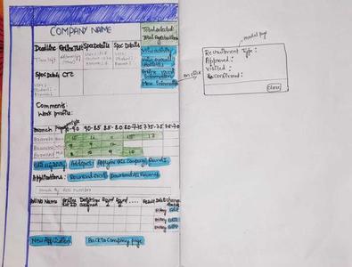
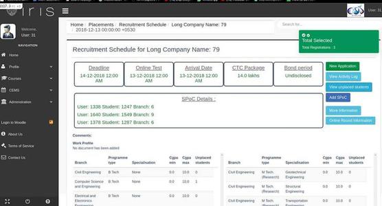
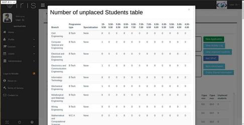
And then added another modal page which shows the number of unplaced students in each range of CGPA for all the branches and specializations which the company is open to.
Throughout the course of this internship, I have gained a better understanding of how a website such as IRIS works on the whole.
I learned how to integrate the front-end and back-end of a website and how to work with MySQL and Ruby on Rails. In addition to these software skills, I learned to work in collaboration with a team. And most importantly, learned that to be a good UI-UX developer, in addition to learning programming languages, you need to be technically sound in all other aspects related to the design and functionality of various websites.
I am thankful for the chance of being under the guidance of my mentors who made sure I was on the right track throughout the process, provided useful and appropriate resources to refer to and made sure I was comfortable throughout the Winter Internship. This was overall a very beneficial and fun experience for me.


