This humble blog post, deals with an aspect of IRIS, that was relatively sidelined when the team had to focus on developing the more critical components of the Student Lifecycle Management System. User Experience is an aspect that can make the difference between your product skyrock its prospects over night and it failing to connect with the intended consumer base.
Let me elaborate with history. Why do we ‘Google’ everything? Why did we not end up ‘Bing’ing or ‘Yahoo’ing it? Take a look at the Google’s search page. Where did it all start for the tech giant. A Google logo and a search bar and a lot of blank space. Typically. The other search giants in question looked at this differently. We have all this whitespace, why not let the user have some more valuable information presented? Why not let the user know what’s happening around him/her/the world? Why not display some photos and videos in that otherwise empty space?
They failed. Google boomed.
The answer is User Experience. Google was the first to figure out that, when a user wants to search for something, that really is all they want to do. Search. We see this in our everyday life on the internet. We judge a website by its look and feel. We even decide it’s authenticity based on these aspects alone. If it ‘FEELS’ right, enough effort and thought has gone into it.
WhatsApp wasn’t the first messaging app of it’s kind. Tez wasn’t the first payment platform. Heck, even Facebook wasn’t half as popular as Orkut in India.
The answer?
User Experience.
User Experience (UX) Development is the procedure of improving the overall experience of the users when they interact with the application or website in order to achieve its objective to provide the maximum user satisfaction. It keeps customers in mind and creates the basic skeleton of any application. The User Interface (UI), on the other hand focuses on the application’s look and feel as to how it interacts with the users.
Being in UX is about user research and solving the actual problems that people have – not just the ones the business or product team thinks they have.
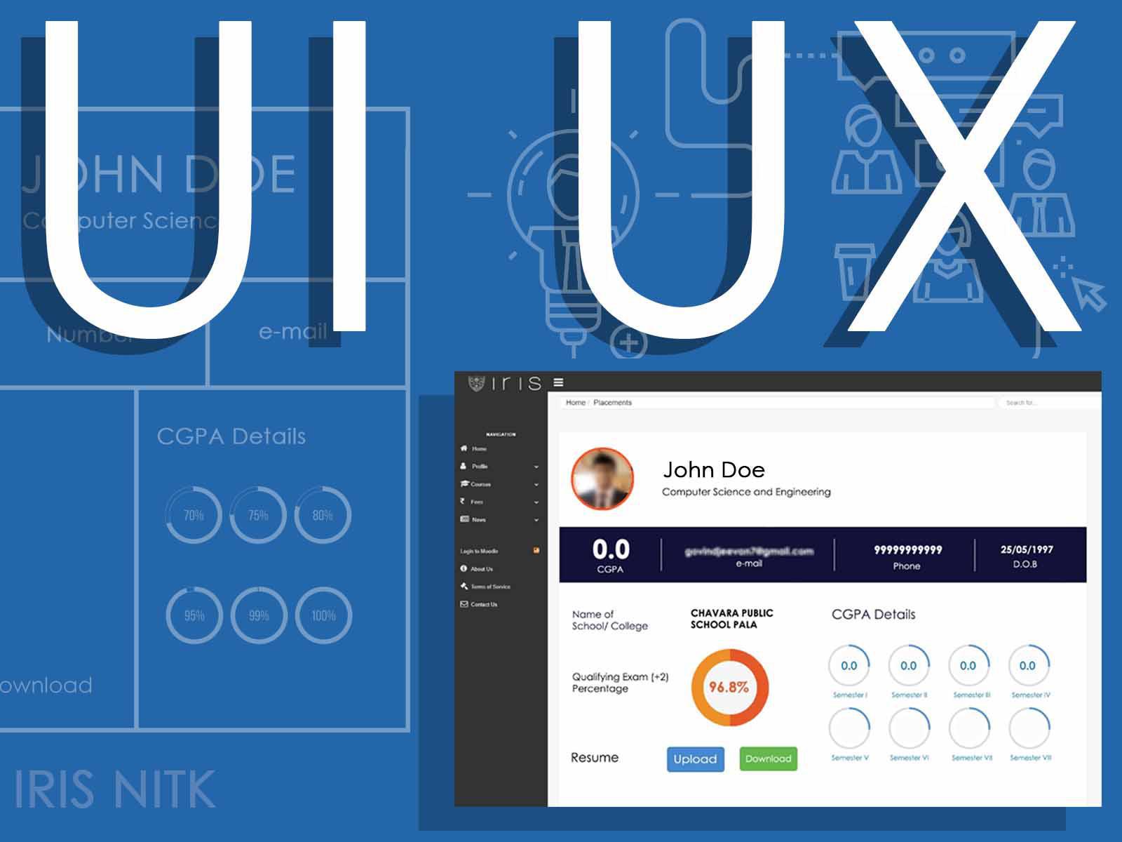
The following is not a tutorial. Not a walk through. It’s not very technical either. It is the process that I followed as a UI/UX Designer, to make IRIS a more usable platform than it already is. Here, in particular, the very vital IRIS Placement module.
Take a look at this illustration, that shows a typical UX design flow.
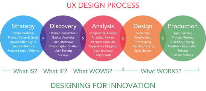 UX Flowchart
1. The Strategy.
This is where a UX designer analyzes his market, understands the crowd. The stakeholders of the system in question is identified and plotted in the Stakeholder Map.
Knowing the nature of the different stakeholder groups, and how they are inter related, and how they will be using the module is vital to formulating a User Research Plan, that elaborates on what strategies and techniques will be followed. An important part of this phase is to prepare a questionnaire specific to each stakeholder. This is crucial to consistently maintaining professionalism in conversations, in order to invariably result in crucial substance for the research at hand.
Take a look at the User Research Plan and note the Stakeholder Map within.
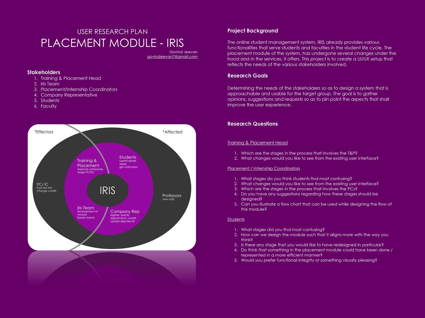 User Research Plan
The User Research Plan and Stakeholder Questionnaire PDF
2. The Discovery.
I presume you might have recently taken a mental note of IRIS’s sudden development of interest in what you think of the platform, courtesy the suggestion forms that were spammed. That was discovery. Or at least one part of it. The stakeholders were defined and the plan of action forumulated. In this phase, the methods specified in the User Research Plan was put into practise.
Discovery Insight in short,
2.1 Students.
There were 44 respondents for the placement module google form circulated primarily for the Batch of 2019, IRIS Placement module’s sole user base so far.
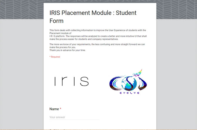 Google Form
Link to the form: (still active)
2.2 PCs/ICs.
A hangouts call session was organized with the head PC and a former IC who is a PC this year, Adithya Kamath and Manali Shah respectively, where the structure and flow of the Placement module was elaborated to the coordinators, during which they were asked to point out the changes in interface and experience they deem required and other suggestions they’d like to see incorporated in the final module. Responses were also also collected from a number of other PCs either by directly contacting them or through their submissions in the form circulated.
2.3 Others.
The other stakeholders were contacted largely via e-mail and asked to browse through the module and put in their valuable feedback.
2.4 User Research Outcome Document.
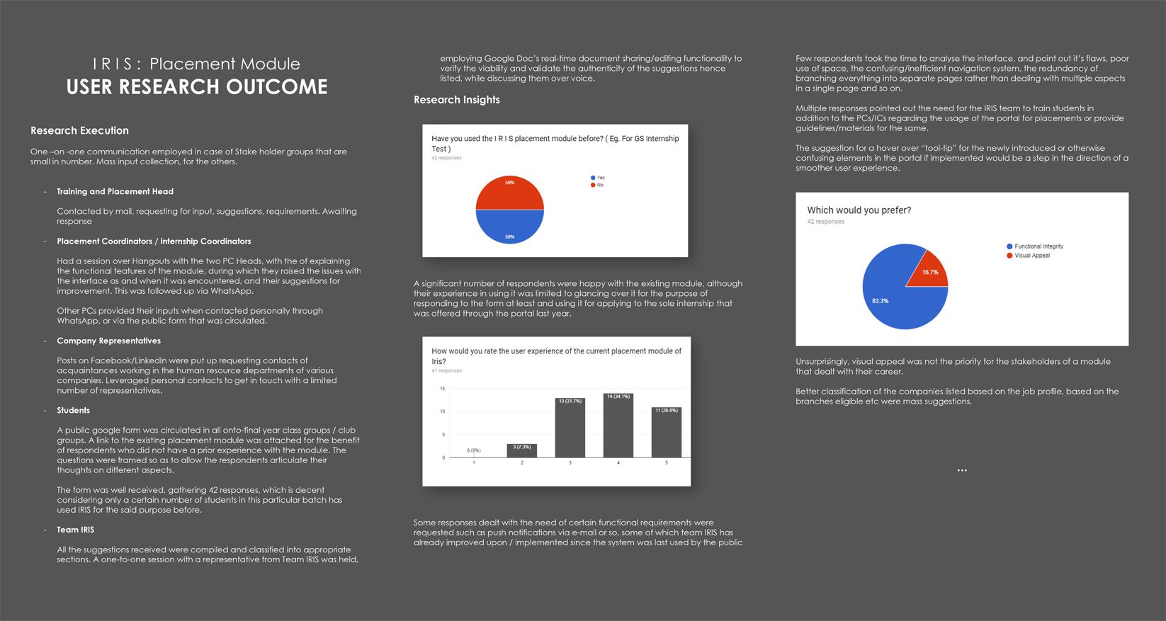 User Research Outcome
3. The Analysis.
At the end of the research phase, I was left with a Google Sheet complete with numerous ideas and suggestions, that largely did not agree with each other. Some responses opined that the current UI was impeccable, while some others complained on aspects of navigation and space utilization.
Several responses commented on the User Experience aspects instead, such as the suggestions highlighting the need for an efficient notification system and avoiding the confusion that seems to exist with deadlines and company visiting status.
One by one, I went through each respondent’s complete list of suggestions and answers in the questionnaire, tried to gain an insight into what might have caused this suggestion to arise, and to understand where in the module this problem lies, or the aspect for which the said suggestion will make a difference.
This identified cause / aspect, was added to the list of “NEEDs”.
- Need an indication of eligibility to apply
- Need more awareness about features/components
- Need to know more about the job while applying
- Need IRIS to be more mobile friendly
- Need a simpler navigation
- Need the companies to be listed based on branch
- Need to avoid confusion regarding deadlines/ dates/process
The recommendations and suggestions offered to tackle these needs, were noted down, to be used in a later stage. But at this point, the priority is the cause, not the solution. Gathering all the insight from the 50 odd stakeholders that I had some sort of correspondence with, I was able to consolidate the crux of research, in the form of 7 needs, that covers the necessity of every suggestion that was made. These seven needs were classified using the MoSCoW Method. Queer name, is it not? Alas, it has nothing to do with the Russian capital. The method of classifying the needs and their corresponding solutions into an order of priority for implementation. The Must Should Could Would Method.
- M – Must have this requirement to meet the business needs
- S – Should have this requirement if possible, but project success does not rely on it
- C – Could have this requirement if it does not affect anything else on the project
- W – Would like to have this requirement later, but delivery won’t be this time
For the purposes of IRIS however, the Coulds and Woulds were practically the same, and were merged into Could.
4. The Design.
Now that the needs were defined, understood and classified, the design phase exorts us to explore these said needs, form our unbiased opinions of them and to exercise utmost liberty in listing out every solution imaginable.
4.1 How Might We.
In that spirit, the first step was taken in a popular UX method known as HOW MIGHT WE. This method is least concerned with feasibility or practicality or even necessity.
How might We (HMW) questions are short questions that launch brainstorms.
They act as seeds for ideation. Given a need, it is simply about analyzing it’s every end, and in twisting it’s every word, and in forming How Might We questions out of these.
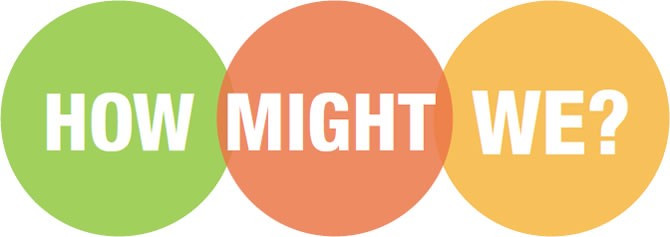 How Might We
The frameworking for doing a How Might We thinking session is below, along with what I thought up for the below need.
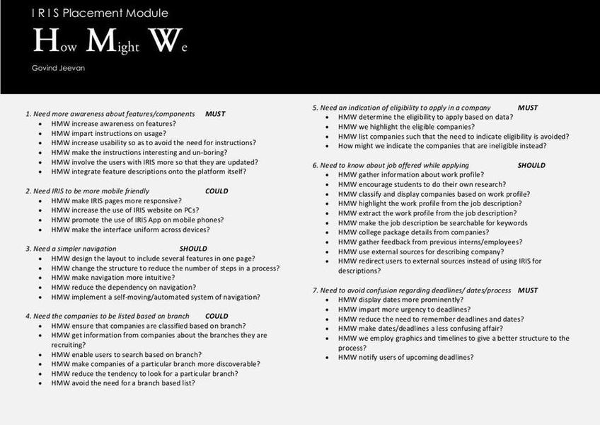
“Need more awareness about features/components”
- Amp up the good: HMW increase awareness on features? HMW impart instructions on usage?
- Explore the opposite: HMW make IRIS usable without instructions?
- Question an assumption: HMW entirely remove the need for instructions?
- Go after adjectives: HMW make the instructions interesting and un-boring?
- ID unexpected resources: HMW use the NITK website, Facebook page, Whatsapp groups to create awareness
- Create an analogy from need or context: HMW make IRIS like a social media platform or a job portal like Internshala.
- Play POV against the challenge: HMW make IRIS what users want to use so that they are always familiar with it?
- Change a status quo: HMW make the users more intelligent/smart/self sufficient w.r.t using the module
Take a look at the How Might We document that was prepared. Do take note of the Must Should Could classification of the 7 needs.
 How Might We Document
4.2 The BrainStorm.
 Brainstorm
All UX/UI processes eventually leads to this phase. We have talked to the users, understood them. We have identified their needs, thought about it, thought about all the different ways we can do justice to them. Now, we talk about solving them. For every need, we had formed a set of How Might Wes, which you have been through.
Then I brainstorm on each need, considering every one of the How Might Wes and come up with actual real world solutions. Although I specified real world solutions, I clarify that by no means care about it’s implementational feasibility in the said project. Succeed in failing to bother about the expense or effort required and in determining if they are practical in the current context.
Brainstorm. Come up with every and any possible solution that shall satisfy the need at hand. The How Might We document, acts as a guide that encourages us to explore different kinds or different approaches of solutions to the same problem. I must say, even though the How Might We was prepared by me, if not for the documentation of all those How Might Wes, I would have failed to come up with as many solutions as I have for each need while brainstorming on them. One would satisfy oneself with one or two approaches and ignore the less plausible ones. The less plausible ones, may eventually turn out to be the most effective.
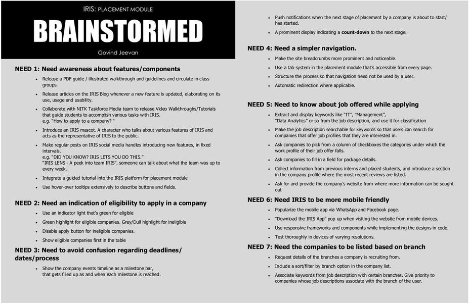 Brainstorm Document
4.3 The Brainstorm Convergence.
The liberty I enjoyed thus far, ends here. This is where one starts taking the role of a responsible adult, and encourage practical thought.
- Which of those ideas fit the bill?
- Which among them fits within the bill?
- Do we have the technical capacity to carry out these solutions?
- Do we have the expertise? Are these features desirable enough to invest in? Will the return of investment be favourable?
- Do the users really want these features?
- Can we accept the time and human resource that must be put into these solutions?
These questions are bound to strike off a couple of those amazing ideas one would think up in a brainstorming session. An effective way to do this, is using a 2X2 Matrix. Where the desirability of a solution is pitted against it’s feasibility.
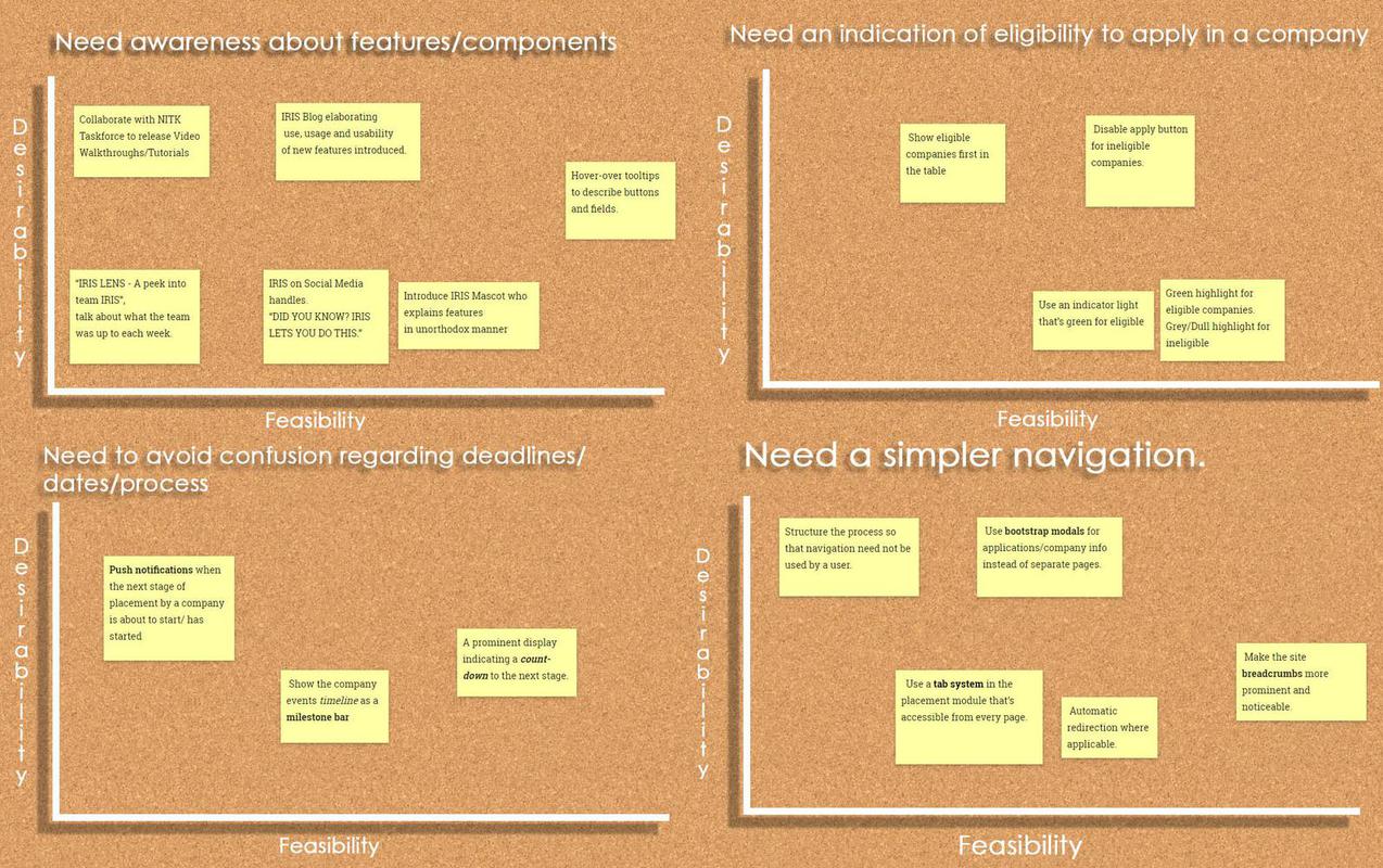 Convergence
The solutions that are high on desirability and high on feasibility are known as low hanging fruit and they are prioritized during implementation.
All Brainstorm Convergence Graphs
4.4 The Wire frame & The Visual Design.
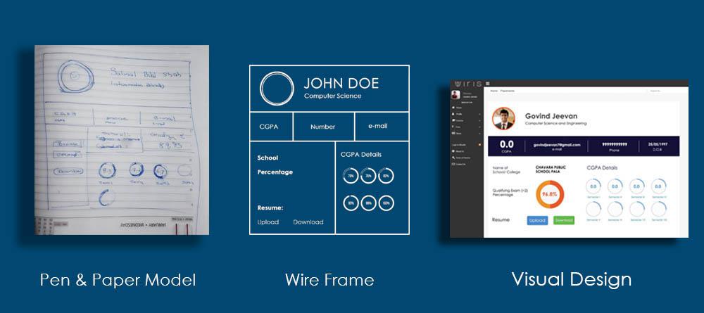 Design
Pen and Paper models were framed based on the suggestions put forward by the users, gathered during the discovery stage, and the Post Prioritization list of brainstormed ideas.
Here, the layout and visual structure is represented using lines and shapes. Tool like Adobe Illustrator can be made use of to this effect. I felt more comfortable with Pen and Paper models, as it was sufficient for this task.
Visual Design involves evolving the wireframe into a high level design, a visual depiction of how the platform would finally look to the user. Design software and tools like InVision, Balsamiq, even Photoshop/Illustrator or Adobe’s new XD, are used at this stage.
4.5 The Prototype.
Prototyping is where the process moves into code. The basic code structure. This is the task of a front-end developer, which also forms a subset of UX.
At the time this blog was penned down, I was in this stage. Prototyping, guided by the visual designs I made and following the other technically sound directives that were agreed upon to be part of the user experience of the platform.
Beyond this is the Production stage where one buids the entire application satisfying the UX requirements and then undergoing thorough testing.
UX is a wide domain that sums up everything about the development of an application. It’s not limited to frontend or backend or content or layout. It encompasses everything. Because each of these contribute to the experience of the user, and to enrich the said experience, a UX designer must be ready to listen, research, comprehend, empathize, classify, ideate, prioritize, visualize and implement.
To more such experiences and endeavours. Thank you for reading!
Social Responsibility. Inherent Creativity. Technical Capability.